Design Notes & Set Dressing approach
Authentic but elevated reality that evolves across each of the 8 dates/episodes.
Discovering how everyday spaces can be framed and enhanced to reveal emotional depth and function as emotional landscapes.
Production design that doesn’t call attention to itself, but rather creates a genuine world that feels lived-in and emotionally resonant.
Balance visual richness with naturalistic truth, crafting environments that feel discovered rather than designed.
DESIGN DEVICES IN CONNECTED SPACES
COLOUR PALETTE
Dominant warm tones: Amber, ochre, soft golds, and gentle yellows creating cocoon-like environments
Complementary cooler accents: Desaturated teals and blues creating depth and balance
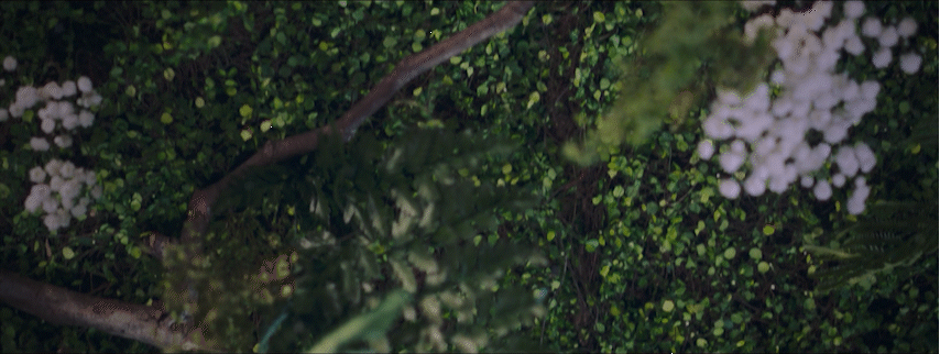
Organic greens: Abundant plant life creating living environments
Slightly muted colors that feel genuine rather than heightened or stylised - leaving room for pops of striking colour - the blue scrunchy etc
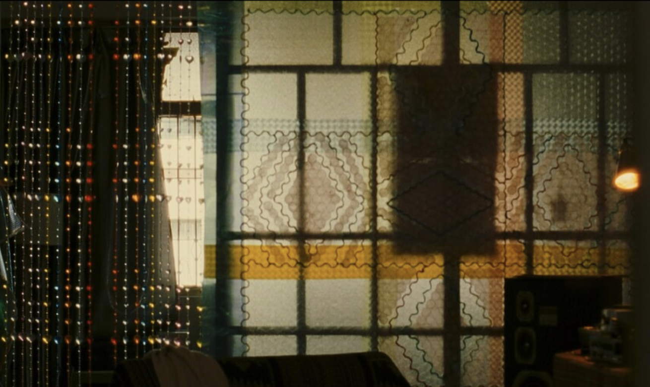
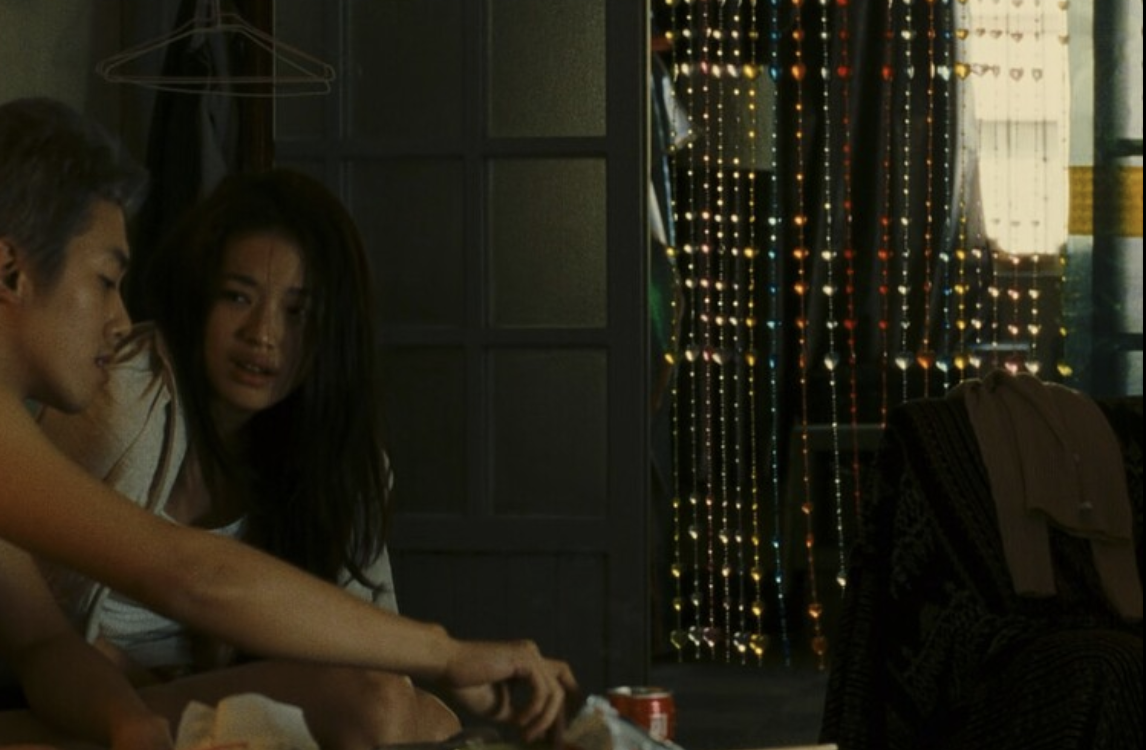
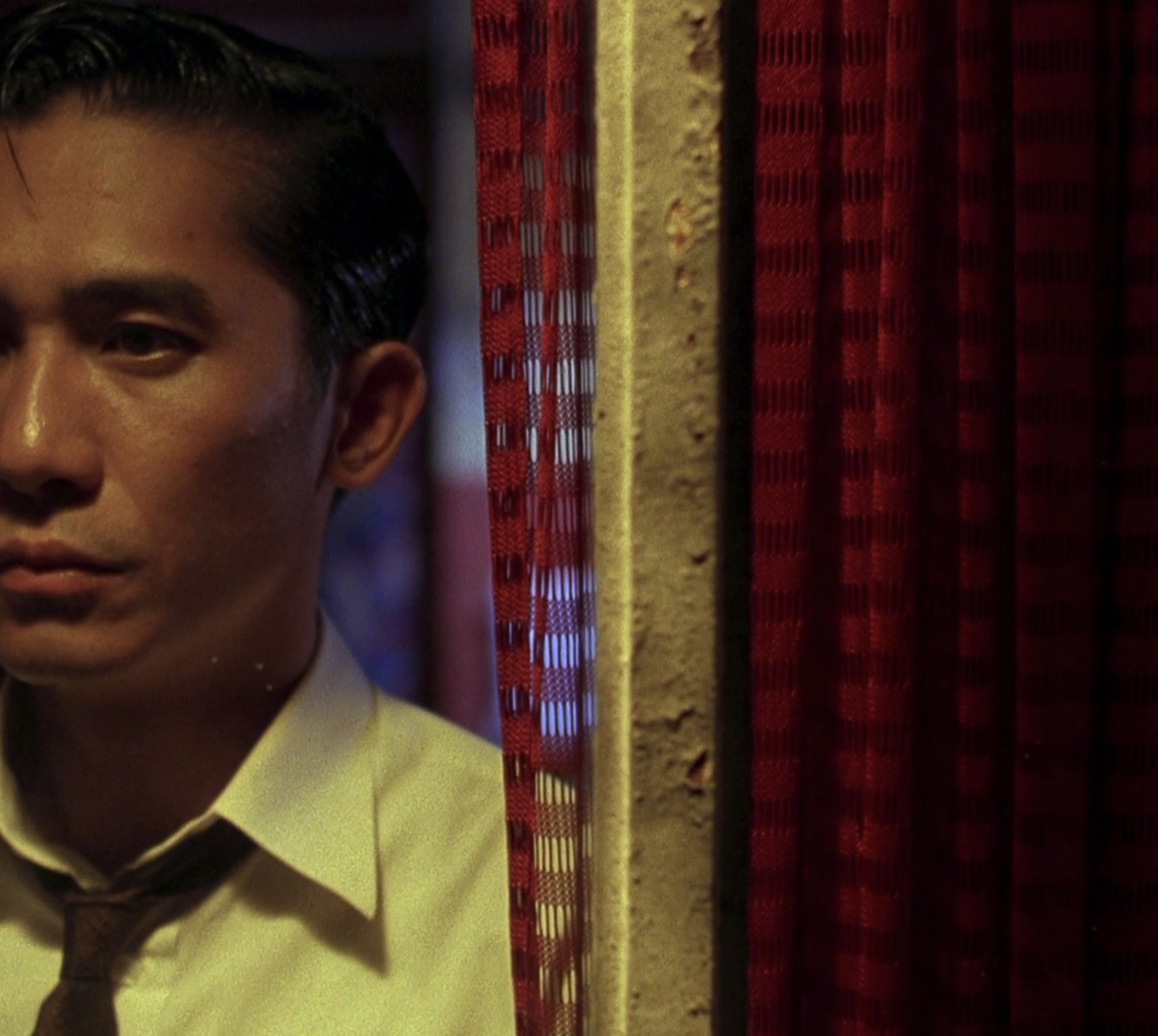
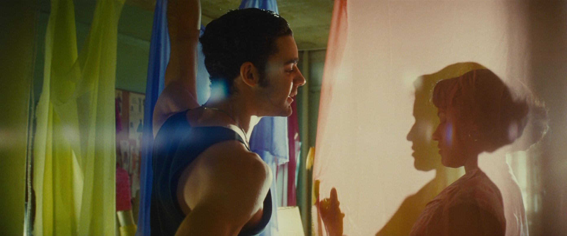
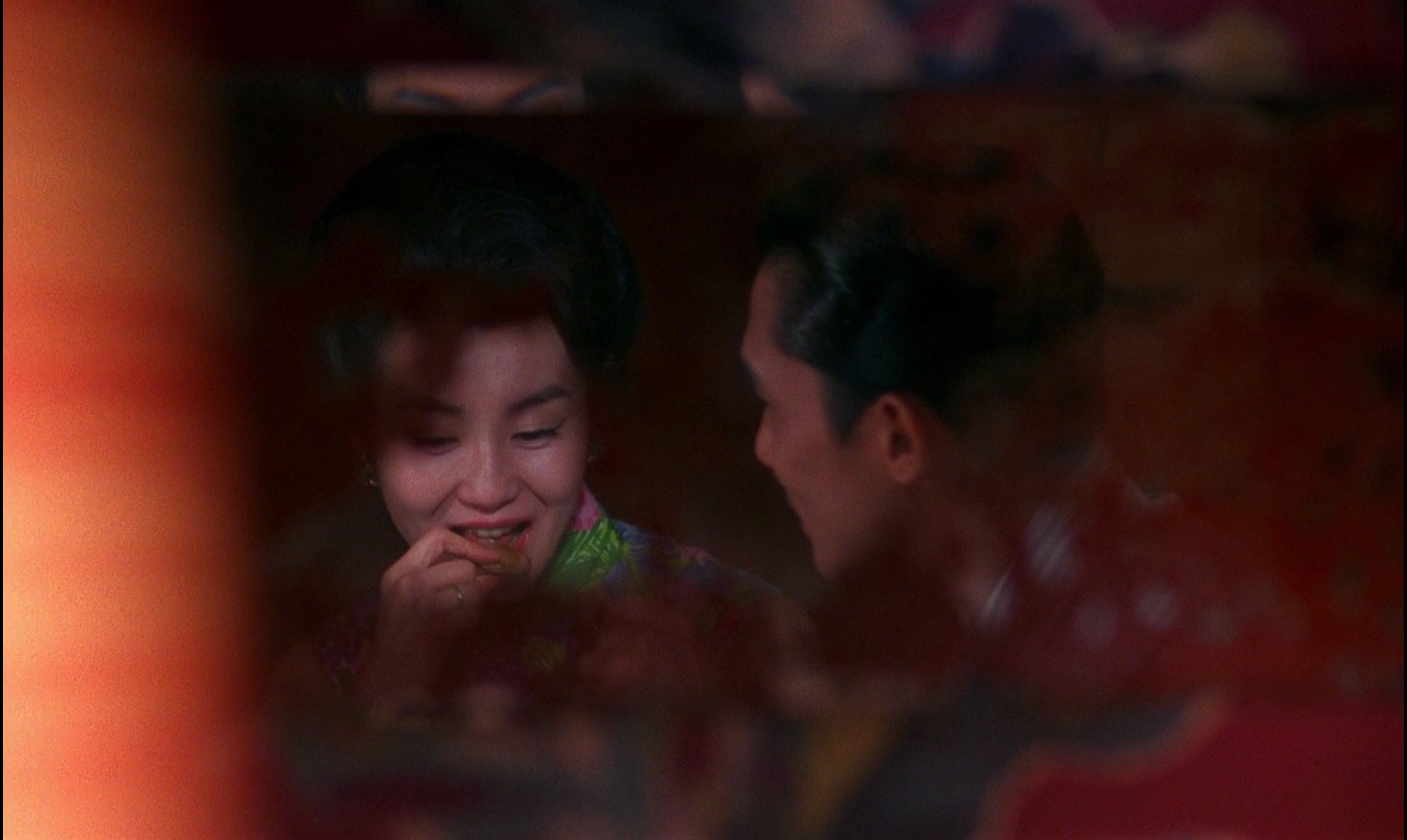
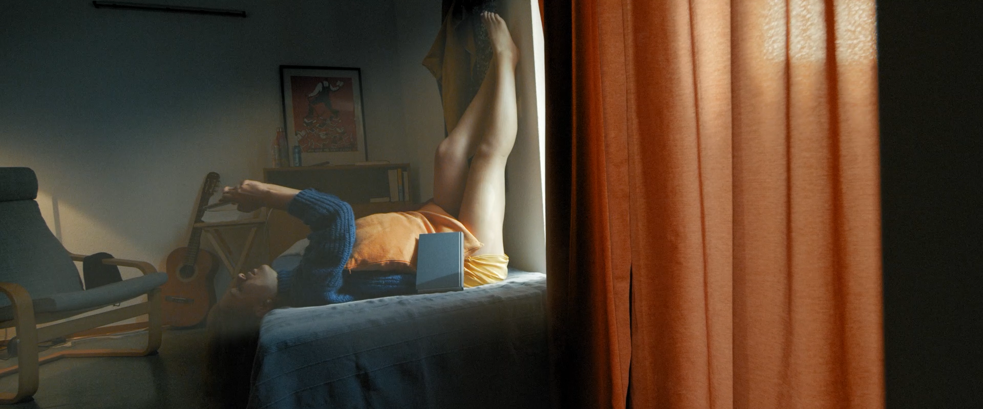
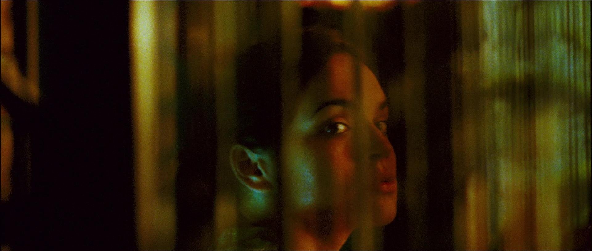
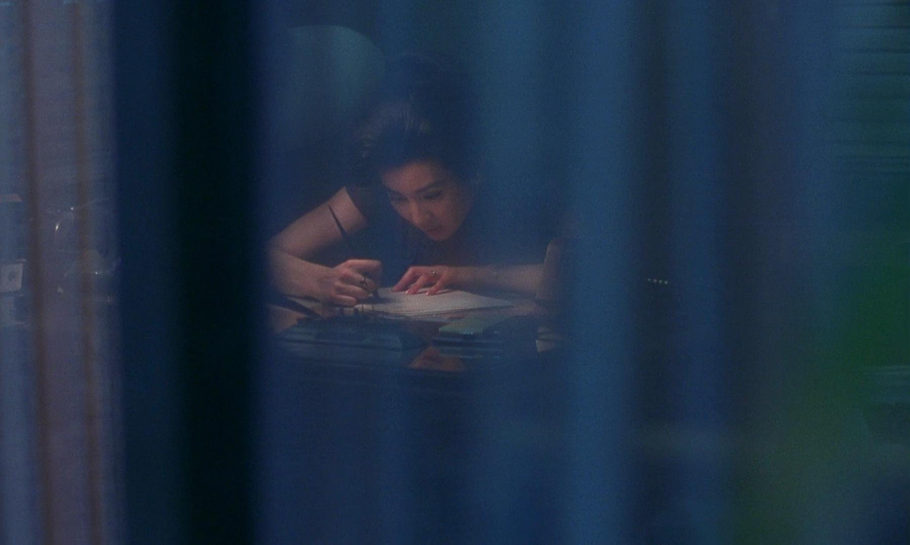
TRANSLUCENT LAYERS & THRESHOLDS
Sheer fabrics & curtains: Diffusing light and creating dreamlike atmospheres that soften edges while revealing silhouettes
Beaded curtains & textured screens: Creating permeable boundaries that characters can pass through
Textured glass: Distorting yet revealing, creating a sense of seeing someone through a personal lens
Multiple frames within frames: Doorways, windows, and architectural elements that create compositions where characters exist in shared spaces
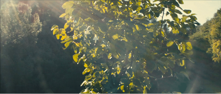
LIGHT QUALITY & INTERACTION
Warm glows of amber and red in M&L House
Dappled natural light: Filtered through foliage or window coverings to create organic patterns that dance across faces and spaces
Bokeh effects ? - emphasise the present moment & subjectivity ?
DISCONNECTED SPACES
Harder Architectural Lines: More geometric and less organic shapes
Use of Negative Space: Emptiness that creates emotional distance
Reflective/Cold Surfaces: Glass, metal, concrete that create visual barriers eg Sixth Date (Election Night/Restaurant): Space that allows for progressive visual fragmentation that mirrors their argument—starting cohesive and becoming increasingly divided?


Emily
Sophisticated urban style / her spaces and belongings feel more curated
Palette - slate blues, crisp greys, dusky pink with supporting pops of vibrant berry and mustard
Personal items reflect design-conscious sensibility—minimal but deliberate choices like distinctive ceramic mug, sleek tech with custom cases,
Large bag with multiple items shows a bit of contained chaos
Ryan
His style is more organic and accumulated rather than designed, with objects inherited or chosen for function over aesthetic statement
His personal style not reflected in his office space - at odds with it
Warm amber and olive palette evokes natural materials and comfortable familiarity
Well-worn leather satchel with visible patina,